As a blogger and SEO, I spend an ungodly amount of time creating content. We pour hours into research, writing, and optimizing, hit 'publish', and then... what? We pray. We pray the Google gods smile upon us and that someone, anyone, actually shares our masterpiece. The content hamster wheel is exhausting.
I’ve always known that visual content is king. Infographics, in particular, are like catnip for social media and can be amazing for getting backlinks. But who has the time? Or the budget? A good infographic can cost hundreds of dollars and take days, if not weeks, of back-and-forth with a designer. Most of the time, I just sigh and move on to the next blog post.
So, when I stumbled upon a tool called Infography, which claims to turn full blog posts into “stunning” infographics in literally seconds, my skepticism-meter went through the roof. Another AI tool promising the world? Sure. But my curiosity got the better of me. I had to see if it was just another gimmick or a genuine solution to one of my biggest content headaches.
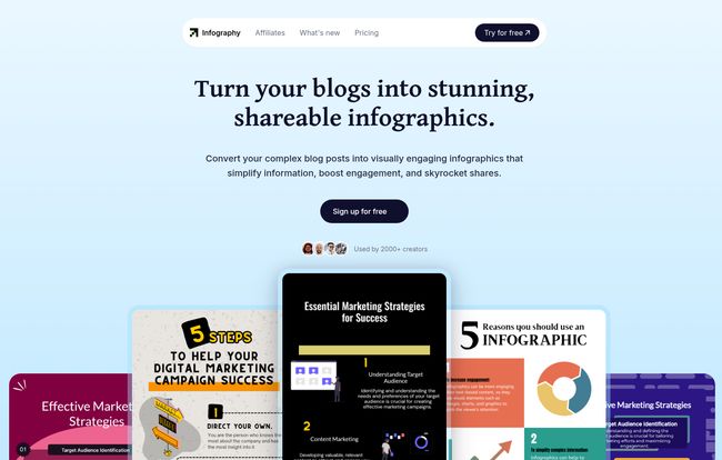
So What is Infography, Anyway?
In a nutshell, Infography is an AI-powered tool that acts like a super-smart, lightning-fast junior designer. You feed it a URL to one of your blog posts, and it reads, digests, and transforms the key information into a professional-looking infographic. It's designed to be a content repurposing machine, breathing new visual life into the words you’ve already written. No design skills needed. No poring over data. Just paste a link and go.
The whole idea is to take your well-researched, long-form content and make it snackable, shareable, and way more visually appealing for platforms like Pinterest, LinkedIn, or even just to break up a text-heavy article.
Visit Infography
I Took It for a Spin: A Real-World Test
Talk is cheap, so I decided to throw one of my own articles into the ring. I picked a moderately complex one, about 1,500 words, with a few listicles and data points. I copied the URL, pasted it into the Infography dashboard, held my breath, and clicked “Generate.”
And… wow. Before I could even take a proper sip of my tea, it was done. The whole process took, and I'm not exaggerating, maybe five seconds. What it produced wasn't just a random collection of text boxes; it had pulled the main headings, summarized the key points, and selected icons and a layout that actually made sense. It was… impressive.
Was it perfect? Not quite. One of the sub-points it pulled could have been phrased a bit better, and I would have chosen a different icon for one section. But that’s the thing—it gave me a 90% finished product. A few quick clicks in their editor to tweak the text and swap an icon, and I had a genuinely solid, usable infographic. The time saved was just absurd. From a 10-hour job to a 10-minute touch-up. That's a trade I'll take any day of the week.
The Real Scoop on Infography
What I Absolutely Loved About It
The speed and cost-effectiveness are the most obvious wins. Their website claims it can save 99% on design costs, and honestly, that doesn’t feel like an overstatement. A single infographic from a freelancer can easily run you $150-$350. With Infography, you’re looking at a cost per design that’s less than a dollar. It’s wild.
The “zero learning curve” claim also holds up. If you can copy and paste a URL, you can use this tool. There are no complicated menus or functions to learn. It just works. For small teams or solo creators who wear multiple hats, this is huge. You can also customize the output with your own brand colors, fonts, and logo, which is a must-have for maintaining a consistent brand image. For the more tech-savvy folks, they even offer an API, which could be amazing for content platforms or marketing agencies looking to integrate this functionality into their own systems.
A Few Things to Keep in Mind
Now, it’s not all sunshine and rainbows. You still need to use your brain. Think of the AI as a brilliant but very literal assistant. It will do the heavy lifting, but you're the creative director. You’ll probably want to do a quick proofread and make some minor tweaks to ensure the tone and focus are exactly right. This isn’t a flaw, just the reality of working with AI today. It’s a collaborator, not a replacement for human judgment.
The other thing I noticed is their refund policy. According to their FAQ, refunds are only available for yearly plans. This isn't a deal-breaker for me, given the low cost, but it's something to be aware of before you commit. It's a sign that they're confident you'll stick around once you see the value, but it's still a point to consider.
Breaking Down the Cost: Is The Price Right?
Okay, let's talk money. This is often where these cool new tools fall apart. But Infography’s pricing seems, well, incredibly reasonable. They have a couple of main tiers, and they often run a nice 50% discount if you pay for a year upfront.
| Plan | Yearly Price | AI Credits | Key Features |
|---|---|---|---|
| Lite | $7.50 / month | 50 per month | Custom watermark, 100+ languages, Email support |
| Pro | $15 / month | 250 per month | All Lite features, add up to 5 users, Priority support |
Note: Prices are based on the yearly plan and may vary. Check their website for the most current pricing.
My take? The value here is fantastic. With the Lite plan, you're paying about 15 cents per infographic. Even if you only use it for a handful of posts each month, you’re getting your money's worth almost instantly compared to any other method. For agencies or content teams, the Pro plan with 250 credits and multi-user support is a no-brainer.
The Unspoken SEO Benefit of Infography
As an SEO guy, my mind immediately goes to backlinks and engagement. And this is where a tool like Infography really shines beyond just looking pretty. An excellent infographic is a highly linkable asset. Other bloggers are far more likely to embed your infographic in their articles (with a credit link back to you, of course) than they are to just link to another block of text.
I'm already thinking about how this fits into strategies like Brian Dean's famous Skyscraper Technique. You find a popular article, create something way better, and then do outreach. Imagine adding a custom, high-quality infographic to your 'skyscraper' content. It instantly makes your piece more valuable and shareable.
Plus, embedding these visuals in your posts can increase user dwell time—a signal to Google that your page is valuable. And don’t forget basic image SEO. A well-named image file and descriptive ALT text on your infographic can help you rank in Google Image search, driving even more traffic.
My Final Verdict: Is It a Keeper?
So, is Infography a gimmick or a game-changer? For me, it falls squarely in the game-changer camp. It’s not going to put high-end graphic designers out of business, nor should it. But it perfectly fills a massive gap for bloggers, marketers, and businesses who need to create professional visual content quickly and affordably.
It’s a force multiplier for your content strategy. It lets you work smarter, not harder, by repurposing your best content into a new, highly shareable format. It’s like having a junior designer on call 24/7, ready to go at a moment's notice, for the price of a couple of lattes a month. For me, it’s already earned a spot in my toolbox.
Frequently Asked Questions
- What is the refund policy for Infography?
- Refunds are typically only offered for yearly plans, within a specific timeframe after purchase. It's best to check their terms of service for the exact details before subscribing.
- Can I use the generated infographics for commercial purposes?
- Yes, absolutely. The infographics you create are yours to use for your blogs, social media, marketing campaigns, and other commercial needs.
- What AI model does Infography use?
- They state that their underlying LLM (Large Language Model) is subject to change as they incorporate the latest and greatest technologies, ensuring the tool stays cutting-edge.
- Do I need any design experience to use this tool?
- Nope. None at all. That’s the beauty of it. The platform is designed with a “zero learning curve,” so anyone can get started right away.
- Does it work for languages other than English?
- Yes, the plans mention support for over 100 languages, making it a versatile tool for international content creators.
- Are there discounts available for non-profits or schools?
- The FAQ on their site suggests reaching out to their support team to inquire about potential special discounts for non-profit and educational institutions.
Conclusion
In the relentless quest to capture audience attention, tools that offer a genuine competitive edge are rare. Infography feels like one of those tools. It efficiently solves a real, expensive, and time-consuming problem for content creators. By turning your existing blog posts into engaging visual assets, it helps you squeeze more value out of every single word you write. If you're tired of the content grind and looking for a smart way to boost your engagement and reach, I'd say giving Infography a try is well worth your time.