How many hours of your life have you wasted trying to make a chart in some spreadsheet software look... well, not hideous? You wrestle with colors, fight with labels, and after 30 minutes of pure frustration, you end up with something that still needs a 10-minute explanation in your weekly meeting. It’s a shared trauma for marketers, founders, and product managers everywhere.
I’ve been in the SEO and digital marketing game for years, and I can tell you, data is everything. But data is useless if you can’t communicate it. An ugly, confusing graph is worse than no graph at all—it actively creates misunderstandings. So when I heard the buzz about a tool called Graphy, claiming to make data storytelling easy, fast, and beautiful, my cynical-veteran-blogger senses started tingling. Could this be the one?
So What is Graphy, Actually?
At its core, Graphy is a web-based tool for creating charts and graphs. Simple enough. But that’s like saying a supercar is just “a way to get from A to B.” The entire philosophy behind Graphy is different. It’s not built for data scientists who need to run complex regressions. It’s built for the rest of us—the communicators. The people who need to take a set of numbers and turn it into a compelling story that convinces a stakeholder, aligns a team, or wows an audience.
And it seems to be working. They're already trusted by over 100,000 people at companies I actually recognize, like Vercel, Gamma, and Lattice. That’s not just startup fluff; these are serious, data-driven teams. So, they’re clearly onto something.
First Impressions: Ditching the Dreaded Learning Curve
The biggest claim Graphy makes is that it's remarkably easy to use. I've heard that one before. I’ve onboarded onto so-called “intuitive” platforms that felt like trying to assemble IKEA furniture in the dark. But with Graphy, I have to admit, it was different.
There was no hour-long tutorial video. No 50-page help doc. You connect your data (like a Google Sheet, which is a lifesaver) or paste it in, and the platform pretty much guides you. It uses AI to suggest chart types and even pull out initial insights. The whole process feels less like building a chart and more like discovering it. They claim to be 80% faster than other data visualization tools, and honestly, that doesn’t feel like an exaggeration.
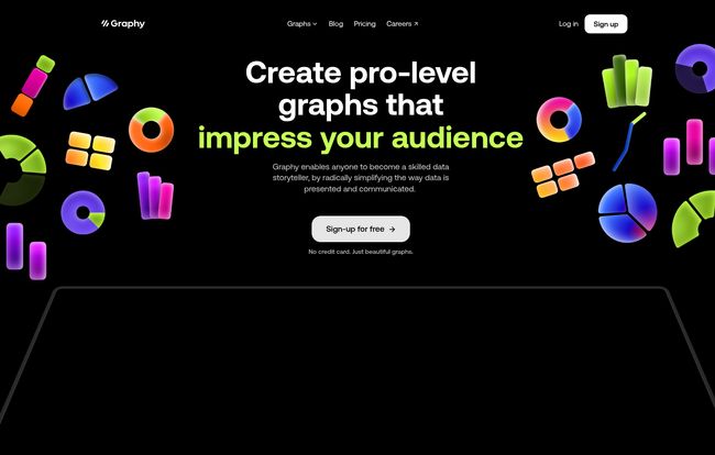
Visit Graphy
Think about the classic “before and after.” The “before” is that cluttered, confusing bar chart that makes five different people in a meeting come to five different conclusions. The “after” with Graphy is clean, clear, and gets everyone on the same page. That’s the whole ballgame right there.
The Features That Actually Change Your Workflow
A pretty interface is nice, but it's the features that determine if a tool sticks around in my bookmarks bar. Graphy has a few that are genuine game-changers.
AI-Generated Magic or Just a Gimmick?
The “AI-generated charts” feature sounded a bit like a marketing buzzword, but it’s surprisingly helpful. Instead of you having to pick a chart type, the AI analyzes your data and suggests the best way to visualize it. More than that, it can generate little text-based insights, like “There was a 25% increase in Q3.” It’s like having a junior data analyst on your shoulder, pointing out the obvious so you can focus on the why. It’s not going to write your whole report for you, but it’s a fantastic starting point.
Integrations That Respect Your Time
This might be my favorite part. Graphy is built to be shared. You’re not just exporting a static PNG file (though you can). You can embed your live, interactive charts directly into the tools you already use every day. We’re talking Notion, Slack, Canva, Gamma, even Microsoft PowerPoint. This is huge. It means your report in Notion always has the latest data, with no need to re-upload images. It turns your charts from a dead-end artifact into a living part of your project.
Making Data Beautiful and Persuasive
The charts just look good. Out of the box. They’re clean, modern, and interactive. Viewers can hover over data points to get more detail. But you can also add visual annotations—arrows, callouts, trend lines—to guide your audience’s attention. This is the essence of data storytelling. You’re not just showing the data; you’re telling people what to look at and why it's important. It's the difference between handing someone a map and being their personal tour guide.
Let's Talk Money: The Graphy Pricing Breakdown
Okay, the part everyone scrolls down for. Is it going to cost an arm and a leg? Surprisingly, no. The pricing structure is actually one of its strongest points, in my opinion.
Here’s a quick breakdown:
| Plan | Price | Key Features |
|---|---|---|
| Free | Free for everyone | Unlimited charts, share anywhere, limited AI use. |
| Plus | $12/user/month (annual) | Everything in Free, plus brand colors, no watermark, unlimited AI. |
| Business | Talk to Sales | Everything in Plus, plus dedicated support & enhanced privacy. |
That Free plan is incredibly generous. Unlimited charts you can share anywhere? That’s enough for most individuals, students, or small teams just getting started. The main trade-offs are the Graphy watermark and limited AI credits. For a professional or a company, the Plus plan at $12 a month is a no-brainer to add your own branding and go all-in on the AI features.
My Honest Take: The Good and The Could-Be-Better
No tool is perfect, right? After playing around with Graphy, here’s my bottom line.
The good is obvious: It’s fast, the user interface is a joy, and the final results are stunning. The integrations are top-notch. It solves a very real, very annoying problem for a huge number of professionals.
"Graphy is simply the best tool for making beautiful charts, fast. Their team ships new features at a dizzying pace." – Ryan Hoover, Founder of Product Hunt
As for the downsides? If you're a data scientist who lives and breathes R or Python and needs to create hyper-specific, statistically complex visualizations, this might feel a bit limiting. The whole point of Graphy is to simplify, which means it purposefully abstracts away some of the granular controll you'd find in more technical platforms. But for 95% of business use cases, that’s a feature, not a bug.
Conclusion: Is Graphy Worth Your Time?
Unequivocally, yes. Especially since you can try almost the entire product for free. It elegantly solves the problem of creating clear, persuasive, and beautiful charts without the steep learning curve or clunky interface of traditional tools. It's one of those rare peices of software that does exactly what it promises to do, and does it with style.
Stop fighting with your spreadsheet software. Stop making charts that need a manual. Give Graphy a spin. It might just bring a little bit of joy back to your reporting process. We could all use a little more of that.
Frequently Asked Questions about Graphy
- Can I really use Graphy for free?
- Yep. The free plan lets you create and share unlimited charts forever. It will have a small Graphy watermark, and your access to the AI features will be limited, but it's incredibly capable.
- How do I share my Graphy charts?
- You can share a direct link, or embed your interactive charts directly into other tools like Notion, Medium, or even your own website. It's designed to be shared wherever you do your work.
- How can I get rid of the Graphy watermark?
- To remove the watermark and add your own brand colors, you'll need to upgrade to the Plus plan. This is the main reason for professionals to upgrade.
- Does it connect to Google Sheets?
- Yes, it has a fantastic integration with Google Sheets, allowing your charts to stay synced with your source data. It also has an API for connecting to other data sources.
- Is Graphy difficult to learn?
- Not at all. Its main selling point is that there's practically no learning curve. It's designed to be intuitive and fast, even for people who aren't data experts.
- Are there any discounts for students or educational use?
- The website's FAQ mentions educational discounts are available. You'd likely need to reach out to their support team for the specifics on that.
Reference and Sources
- Graphy Official Website
- Graphy Pricing Details
- Vercel - An example of a data-driven company using Graphy.
