We've all been there. It's 3 PM, you're deep in the content trenches, and someone—a client, your boss, maybe even that little voice in your head—says, "You know what this blog post needs? An infographic." A collective groan ripples through the marketing world. For most of us, that means firing up a clunky design tool, wrestling with templates that never quite fit, and spending the next three hours fighting with alignment tools. It’s a total workflow killer.
For years, I've preached the gospel of visual content. I've quoted the HubSpot stats about engagement, I've talked about how visuals improve information retention, I've championed them for breaking up intimidating walls of text. But I'll be the first to admit, making them is a pain. Or at least, it used to be.
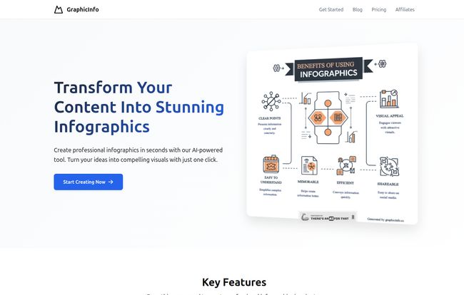
A few weeks ago, I stumbled upon a tool called GraphicInfo. The landing page made a bold claim: "Transform Your Content Into Stunning Infographics" with a single click. My inner skeptic, honed by years of over-hyped MarTech, immediately rolled its eyes. "Sure, buddy," I thought. "One click." But my curiosity, the one that always gets me to sign up for free trials, won out. And honestly? I’m still a little bit shocked.
Visit GraphicInfo
So, What is GraphicInfo, Really?
Okay, let's get the jargon out of the way. GraphicInfo is an AI-powered infographic generator. But that description feels a little flat, like calling a rocket a 'fast tube'. It doesn't capture the magic. This isn’t just another Canva-clone with pre-made templates you plug text into. The core of GraphicInfo is an AI that actually reads and understands your content. You feed it a block of text—an article, a report, a list of stats—and it doesn't just populate a template. It digests the information, identifies the key points, and then generates a custom visual structure to represent that information logically.
Think of it less like a design tool and more like a brilliant, slightly quirky graphic design intern. You give it the brief (your text), and it comes back moments later with a surprisingly solid first draft. It’s a completely different approach to visual content creation.
My First Spin: Putting the “One Click” Promise to the Test
I decided to throw it a real-world test. I grabbed the text from a recent blog post I wrote about common SEO mistakes. It was about 800 words, with a handful of key points and some data. I pasted the whole thing into GraphicInfo, held my breath, and clicked “Generate.”
The Initial Generation
It was fast. Like, scary fast. I didn't even have time to go get a coffee. In what felt like maybe 20-30 seconds, a full-blown infographic was staring back at me. The AI had correctly identified my main points and turned them into sections. It had pulled out key phrases, selected relevant-ish icons, and created a visual flow that made sense. Was it perfect? No. But it was a shockingly good 80% of the way there. Better than a blank canvas and a blinking cursor, that's for sure.
Fine-Tuning the Details
This is where I expected the experience to fall apart. Usually, AI-generated stuff is a nightmare to edit. But GraphicInfo's editor was surprisingly intuitive. I could click on any text block, rewrite it, change the font, or adjust the size. I could swap out the AI's chosen icons for better ones. The color palette was easy to change to match my brand's. It was less about building and more about refining. I spent maybe 15 minutes tweaking a few things, and the result was an infograhpic that I would have happily published.
A Closer Look at the Key Features
After that initial test, I started digging deeper. This thing is more than a one-trick pony. The feature set is lean but powerful, focusing on what actually matters.
Creative Mode: This Is the Secret Sauce
Okay, this is the part that really got me excited. Most design tools are built on templates. You pick a layout someone else made, and you're stuck in that box. GraphicInfo has a "Creative Mode" that throws templates out the window. When you toggle this on, the AI dynamically generates everything—the layout, the visual elements, the entire structure—from scratch, based on your content. No two infographics are the same. This is huge for creating genuinely unique visuals instead of stuff that looks like everyone else's. For content creators who want to stand out, this feature alone is worth the price of admission.
Content Generation and the Online Search
Here's another cool trick. You can give it a topic, and its AI will generate the content for the infographic. I typed in "Benefits of Drip Coffee" and it spit out a pretty solid list of points. It also has a 'Search Online' function that lets it pull in real-time information. This turns the tool from just a visualizer into a light research assistant. I wouldn't rely on it to write a PhD thesis, but for whipping up a quick, informative social media graphic? It's brilliant.
Let's Talk Money: The GraphicInfo Pricing Tiers
Alright, the all-important question: what's this gonna cost me? The pricing structure is credit-based and pretty straightforward, which I appreciate. No confusing feature-gating between the paid tiers.
| Plan | Price | What You Get |
|---|---|---|
| Free Trial | $0 | 5 credits for life, basic AI models. Perfect for testing the waters. |
| Advanced | $9.99/month | 80 credits/month, advanced AI models, better images, all features. |
| Pro | $19.00/month | 240 credits/month, same advanced features. |
| Business | $38.00/month | 800 credits/month, same advanced features. |
In my opinion, the Advanced plan at $9.99 is the absolute sweet spot. 80 credits a month is more than enough for most bloggers, freelancers, or small businesses, and you get access to the better AI models which I did find produced slightly more polished results. For a tool that can save you hours of design work per month, ten bucks feels like a steal.
The Good, The Bad, and The AI
No tool is perfect. After spending a good amount of time with GraphicInfo, here’s my honest breakdown.
What I absolutely loved was the sheer speed. The ability to go from a wall of text to a near-finished visual in under a minute is a game-changer for content velocity. The Creative Mode is a massive differentiator, freeing you from the tyranny of the template. And the fact that the AI generally understands context and hierarchy is deeply impressive technology.
Where there's room for improvement is in the AI's occasional quirks. You still need a human eye to supervise it. The icons it chooses can sometimes be a bit... literal or slightly off-topic. And while the AI-generated content is a great starting point, you'll always want to fact-check it and refine the copy to match your brand voice. This isn't a 'set it and forget it' robot, it's a powerful assistant that still needs your expertise to guide it.
Frequently Asked Questions About GraphicInfo
Is GraphicInfo better than Canva?
They serve different purposes. Canva is a fantastic, versatile design tool based on templates. GraphicInfo is a specialized AI that generates a custom design for you from text. If you want to create a unique infographic fast with minimal design input, GraphicInfo wins. If you want to build a design from scratch with total control over a template, Canva is your go-to.
How many credits does one infographic use?
Based on my testing, generating one infographic seems to use one credit. This makes the plans quite generous, especially the paid tiers.
Can I use my own brand colors and fonts?
Yes. The editor allows you to easily change the color palette of the entire infographic. You can input your specific hex codes to ensure perfect brand alignment. You can also change the fonts for all text elements.
Is the AI-generated content factually accurate?
You should always treat AI-generated content as a first draft. While it's generally good at pulling relevant information, especially with the online search feature, it's not infallible. Always review and fact-check any data or claims before publishing.
My Final Verdict: Is GraphicInfo Worth It?
After my initial skepticism, I’ve become a genuine fan. GraphicInfo has carved out a fascinating and incredibly useful niche for itself. It’s not trying to be an all-in-one design suite; it does one thing—turning text into infographics—and it does it exceptionally well.
For SEOs, content marketers, and bloggers who know they should be creating more visual content but lack the time or design chops, this tool is a massive win. It removes the biggest point of friction in the process. It's not about replacing graphic designers; it's about empowering non-designers to communicate visually and quickly. It's found a permanent spot in my marketing toolbox, and I have a feeling that once you try it, it’ll find a spot in yours too.