As someone who lives and breathes data for a living—traffic reports, keyword distributions, client locations—I've had my share of map-making nightmares. I've wrestled with ancient GIS software that felt like it was designed in 1998. I've tried to force Excel to create a decent-looking choropleth map, only to end up with something that looked like a toddler’s coloring project. It’s a pain. You have the data, you have the story, but getting it onto a map that doesn't look terrible is a whole other battle.
So when a tool like Ultimaps comes across my desk, I'm naturally skeptical. But also… intrigued. It promises beautiful, custom, and even interactive maps in seconds. No design skills, no coding, no pulling your hair out. A bold claim. But after playing around with it for a while, I have to say, they might actually be onto something.
Visit Ultimaps
So, What Exactly is Ultimaps?
At its heart, Ultimaps is a map visualization tool built for the rest of us. It’s designed to take your raw data—whether it's in a spreadsheet or just an idea in your head—and turn it into a clean, professional-looking map. Think of it less like a complex analytics suite and more like Canva, but specifically for geography. Its main gig is making color-coded maps that help people actually understand the numbers, from sales figures across states to survey results across countries.
Who Is This Map-Making Tool Actually For?
I can immediately see a few groups of people breathing a sigh of relief here.
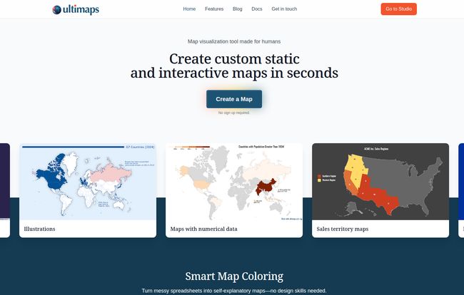
If you're in marketing or sales, creating sales territory maps that are easy to update and share is a game-changer. No more static, ugly JPEGs. Instead, you can have a live, interactive map embedded right in your dashboard. Journalists and bloggers who need to visualize data for a story will find this incredibly fast. Researchers presenting findings, small business owners tracking their customer base, even students working on a project… the applications are pretty broad. Basically, if you've ever thought, "This spreadsheet would make more sense as a map," then Ultimaps is probably aimed at you.
My Favorite Ultimaps Features (The Stuff That Just Works)
Okay, let's get into the nitty-gritty. A tool can have a slick landing page, but the features are what count. Here’s what stood out to me.
From Messy Spreadsheet to Stunning Map in a Snap
This is the first big hurdle most tools stumble on. Ultimaps lets you either upload your data directly (it handles CSV and Excel files) or—and this is the cool part—just tell it what to do. The AI prompt feature is wild. I typed in something like, "Create a map of the US, color states with over 10 million people in blue and the rest in gray," and it just… did it. It even understands messy data. New York, NY, Nueva York? The algorithm is smart enough to figure out you mean the same place, which saves a ton of data-cleaning headaches.
No Design Degree Needed: The Magic of Smart Coloring
I am not a designer. My attempts at choosing color palettes usually end up looking either boring or like a circus threw up. Ultimaps’ “Smart Map Coloring” is a lifesaver. It analyzes your data and picks the right kind of color scheme—whether that's a simple sequential gradient for low-to-high values or a diverging palette to show positive and negative changes. It automatically builds the legend and formats the values correctly ($ vs %, decimals vs whole numbers). It’s one of those “it just works” features that removes a huge mental load.
Bringing Your Data to Life with Interactive Maps
This, for me, is the real magic. A static image of a map is one thing. An interactive one is a whole different level of professional. With Ultimaps, you can create maps that your users can hover over to see specific data points, tooltips, and other information. And the best part? Zero coding required. You just toggle a switch, and it generates the embed code for your website. This is huge for creating engaging content that keeps visitors on your page longer, which we all know is great for SEO.
The Little Details That Matter: Annotations and Styles
Beyond the core functions, you can also add your own personal touches. Need to point out a specific region? Add text annotations, lines, or pins directly onto the map. You can fine-tune the fonts and colors to match your brand's style guide. It's not as overwhelmingly complex as a full-on design tool, but it offers enough flexibility to make the map truly your own.
The Big Question: How Much Does Ultimaps Cost?
Alright, the all-important pricing question. I was pleasantly surprised here. They have a pretty clear-cut tier system that seems to cater to everyone from casual users to large businesses.
| Plan | Price | Best For |
|---|---|---|
| Free | €0 /month | Casual users, students, or anyone wanting to try out the core features. You get unlimited maps and can create interactive embeds. |
| Pro | €49 /month | Professionals, marketers, and businesses who need high-resolution, unbranded exports (SVG, PDF) and more firepower. |
| Custom | Contact for Price | Large teams and enterprises needing custom themes, private sharing, and multiple user workspaces. |
The Free tier is honestly one of the most generous I've seen. The only real catch is that PNG exports will have an Ultimaps attribution mark. But for embedding on a personal blog or internal use, it’s fantastic. The Pro plan is where it gets serious, unlocking high-res exports and removing attribution, which is a must for any professional report or client-facing work.
A Few Things to Keep in Mind
No tool is perfect, right? It’s important to be realistic. The main trade-off, as mentioned, is the attribution on the Free plan's exports. If you need a clean, brand-free PNG for a presentation, you’ll have to upgrade. It’s a fair model, but something to be aware of.
Also, the most advanced features, like custom interactive logic (think: clicking a state to open a specific webpage) and multi-user workspaces, are reserved for the top-tier Custom plan. For a solo blogger or small business owner, the Pro plan is more than enough, but larger organizations will want to look at the custom options.
My Final Verdict: Is Ultimaps Worth It?
Yes. Unequivocally, yes.
For the vast majority of people who need to make a map from data, Ultimaps hits that perfect sweet spot between power and simplicity. It strips away the intimidating complexity of traditional mapping software and focuses on getting you from data to a beautiful, shareable result as quickly as possible. It solves a real, frustrating problem that many of us in the content and data world face regularly.
If you're a GIS professional who needs to perform complex spatial analysis, this might not replace your specialized toolkit. But for the rest of us? For the marketer, the blogger, the sales lead, the consultant? It’s an absolutely brilliant addition to the toolbox. I've already bookmarked it for my next quarterly traffic report.
Frequently Asked Questions about Ultimaps
Do I need to know how to code to use Ultimaps?
Absolutely not. That’s one of its biggest selling points. You can create both static and interactive maps with zero coding knowledge. The platform handles all the technical stuff for you.
What kind of data can I use to create a map?
You can import data from CSV or Excel files. Alternatively, you can use the AI-powered prompt feature to describe the map you want to create, and Ultimaps will generate it based on your text description.
Can I really use Ultimaps for free?
Yes! The free plan is quite robust, offering unlimited maps, the ability to create maps from files or AI, and the option to share and embed interactive maps. The main limitation is that PNG image exports will include an Ultimaps attribution.
What is the difference between a static and an interactive map?
A static map is a fixed image, like a PNG or PDF. It's great for reports and print. An interactive map is web-based and allows users to engage with it, such as hovering over regions to see tooltips with more data. Ultimaps lets you create both.
Can I put my Ultimaps map on my website?
You sure can. Ultimaps provides a simple embed code that you can copy and paste into your website's HTML, similar to embedding a YouTube video. This works on platforms like WordPress, Squarespace, and many others.
What is geocoding and why is it limited on the Pro plan?
Geocoding is the process of converting text-based location data (like 'California' or 'New York, NY') into geographic coordinates on a map. This process costs money to run at scale. The 5,000 monthly requests on the Pro plan is a very generous amount for most users, and it resets each month.
In Closing
Look, the digital world is all about telling compelling stories with data. For a long time, geographical data has been locked behind ugly charts and complicated software. Ultimaps feels like a breath of fresh air. It democratizes map-making, making it accessible, fast, and even fun. If you've ever struggled to put your data on a map, do yourself a favor and give their free tier a spin. You might be surprised at what you can create in just a few minutes.