As someone who’s spent years neck-deep in the worlds of SEO, traffic, and trends, I live and breathe data. But even I get a mild headache when I open a company’s quarterly earnings report. It’s a wall of text. A fortress of numbers and footnotes designed, it seems, by accountants for other accountants.
For years, the choice for the average person wanting to understand a company's health was pretty stark: either learn to read those dense 10-K reports like a pro, or just trust the talking heads on financial news channels. Neither felt particularly empowering. You either drown in data or get spoon-fed conclusions.
Then I stumbled across a tool called Papermoney. Its promise is simple: “Financial Reports Made Easy.” And honestly, after the clunky, spreadsheet-heavy platforms I’ve grappled with in the past, that claim felt like a breath of fresh air. But does it deliver? That's what we're here to find out.
My First Impressions: A Clean Break from the Clutter
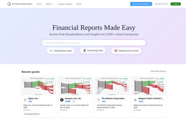
The first thing you notice when you land on the Papermoney site is... the lack of noise. It’s clean. Minimalist, even. There are no flashing stock tickers, no overwhelming news feeds, no pop-ups demanding you sign up for a premium newsletter. Just a simple search bar inviting you to type in a company name.
You can immediately see data on major markets like the United States, Hong Kong, and Mainland China. This is a nice touch, showing it’s not just a US-centric tool. Below the search bar, you'll see recent reports for big names like Amazon, Airbnb, and The Allstate Corporation. It’s all very straightforward, which is exactly what you want from a tool that’s supposed to simplify things.
Visit Papermoney
Visuals That Actually Make Sense
Here’s where Papermoney starts to shine. Instead of just giving you a table with Gross Profit and Net Income figures, it turns them into simple, clear charts. Think of it like a financial EKG for a business. You can see the heartbeat of the company’s profitability over time without needing a PhD in finance.
I’ve always felt that for 90% of investors, the trend is more important than the exact number. Is the profit margin growing or shrinking? Is revenue climbing steadily or is it erratic? Papermoney’s visualizations make answering these questions almost instantaneous. It’s a game-changer for anyone who’s more of a visual learner.
Company Comparisons Without the Headache
This is another huge win. Let's say you're interested in the automotive industry. You could look up Ford’s financials. Then, open a new tab, look up General Motors, and try to flip back and forth, comparing line items. It's clumsy and inefficient. Papermoney lets you pull up companies side-by-side. This cross-sectional analysis is incredibly powerful. You can instantly see who has the better net margin or who is carrying more debt. It’s like putting two athletes’ stats next to each other to see who really has the edge.
The Core Features That Matter
So what’s under the hood? It’s not just pretty charts. Papermoney seems to focus on the fundamentals that truly help you distinguish a thriving business from one that's just treading water.
- Financial Report Visualizations: This is its bread and butter. It takes key data from income statements, balance sheets, and cash flow statements and makes them digestible.
- Comparative Analysis: As mentioned, the ability to compare multiple companies is a standout feature. You can compare direct competitors or even companies across different industries to get a broader market perspective.
- Access to 5,000+ Companies: The database is pretty substantial, covering major global markets. I found most of the big US and international companies I searched for.
- Financial Ratio Analysis: It automatically calculates and displays key ratios like Gross Margin and Net Margin. This saves you the trouble of doing the math yourself and helps you quickly assess profitability.
It effectively acts as a translator. It takes the dense, formal language of financial accounting and translates it into the universal language of charts and trends.
Who is This Tool Really For? (And Who It Isn't)
After playing around with it for a while, I have a pretty good idea of who will love Papermoney.
This tool is perfect for:
- The New Investor: If you’re just starting to build a portfolio and want to do your own homework beyond reading headlines, this is an amazing starting point. It lowers the barrier to entry for fundamental analysis.
- The Business Student: I wish I had this in college. It would have made studying for finance and accounting classes so much more practical and intuitive.
- The Curious Entrepreneur: Want to see how public companies in your industry are performing? This is a quick and easy way to do some competitive research.
Who might need something more?
- The Hardcore Quant Trader: If you're building complex algorithms and need API access to raw, real-time data, this probably isn't the tool for you. Papermoney is about clarity, not exhaustive data feeds.
- The Deep-Value Forensic Accountant: If your strategy involves digging through footnotes to find hidden liabilities, you'll still need to pull up the full SEC filings. Papermoney is a high-level summary, not a replacement for the source document.
The Big Question: What's the Catch? (Pricing & Limitations)
Alright, this is the part where the seasoned digital marketer in me gets skeptical. The tool is fantastic, and it’s… free. So what’s the catch? From what I can see on the site, there isn't an obvious pricing page. The platform provides its visualizations and data on over 5,000 companies at no charge.
This is incredible, but it does raise a few questions. The creators might be planning a 'freemium' model down the road, where the core features remain free but more advanced analytics or a wider range of data could become a paid feature. That's a common and perfectly fair business model. There's also the possibility of limitations on data depth for free users, though I haven't hit any walls yet in my own exploration.
It's also worth noting that, like most modern web apps, it likely requires JavaScript to be enabled in your browser, which is standard for pretty much everyone these days but worth a mention. For now, it seems to be a genuinely free resource, and a powerful one at that.
A Quick Walkthrough: Analyzing Amazon on Papermoney
Just for fun, I typed “Amazon” into the search bar. Instantly, I got a clean dashboard showing me Amazon.com, Inc. (AMZN). The most recent report available was the Income Statement for the quarter ending March 31, 2023.
Immediately, a chart visualized the Gross and Net margins. I could see at a glance that the Gross Margin was 44.0%, while the Net Margin was a much slimmer 2.5%. This simple visual tells a story: Amazon is great at making money from its sales (high gross margin), but its overall profitability is much tighter after all expenses are paid (low net margin). That one chart tells you so much about its business model. Scrolling down would reveal more trends and historical data, all laid out in the same easy-to-read format. Its a great tool for quick insights.
My Final Verdict on Papermoney
I’m genuinely impressed. In an industry often characterized by complexity and information overload, Papermoney takes a decidedly different path. It prioritizes clarity, usability, and visual understanding over sheer data volume.
"It’s not about giving you all the data in the world; it’s about giving you the right data in a way that you can actually understand and act on."
Will it replace the Bloomberg Terminal for high-frequency traders? Of course not. But that’s not its goal. Papermoney is democratizing financial analysis. It’s empowering a new generation of investors and curious minds to look under the hood of a business and make their own informed decisions. And because its free, the barrier to entry is non-existent. For that, it gets a strong recommendation from me.
Frequently Asked Questions
- 1. What exactly is Papermoney?
- Papermoney is a free web-based application designed to help people, especially non-experts, understand company financials. It uses visualizations and comparative tools to analyze financial reports from over 5,000 public companies.
- 2. Is Papermoney really free to use?
- Yes, based on all available information on their website, the tool is currently free. There is no pricing page, and you can access the company data and visualizations without a paywall.
- 3. What companies can I research on Papermoney?
- You can access data for over 5,000 listed companies, with a focus on major markets including the United States (like NYSE and NASDAQ), Hong Kong, and Mainland China.
- 4. Do I need to be a finance expert to use it?
- Not at all! The platform is specifically designed for non-experts. The visual-first approach makes concepts like trend analysis and financial ratios much easier to grasp than looking at raw numbers on a spreadsheet.
- 5. What is financial ratio analysis?
- This is a way to gain insights into a company's performance by comparing different numbers from its financial statements. For example, Papermoney shows you the Net Profit Margin, which is the Net Income divided by the Revenue. A higher percentage is generally better, and this ratio makes it easy to compare the profitability of different companies.