If I have to spend another three hours in Canva wrestling with spacing guides and tiny icons just to make a simple infographic, I might just lose my mind. We’ve all been there, right? You have this great data, this killer blog post outline, and you know—you just know—it would be 100x more engaging as a visual. But the sheer effort involved? It’s a traffic-stopper. Not in a good way.
For years, creating good visual content has been a massive bottleneck for content marketers, bloggers, and pretty much anyone without a graphic designer on speed dial. It's this constant tug-of-war between what we know works (visuals!) and what we have time for (typing words).
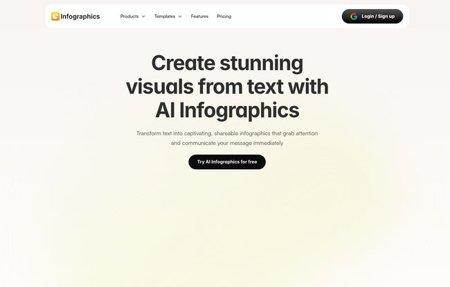
So when I first stumbled upon Infographics.so, my battle-worn SEO heart skipped a beat. The promise was bold, almost arrogant in its simplicity: “Create stunning visuals from text with AI Infographics.” Sure, buddy. I’ve heard that one before. But, ever the optimist (or glutton for punishment), I had to see for myself.
What Is This Infographics.so Thing Anyway?
Think of it this way. You wouldn’t go to your family doctor for brain surgery. You’d go to a neurosurgeon. Infographics.so is that specialist. It’s not trying to be a do-it-all design platform like Canva or Adobe Express. Its one and only job is to take your text—your blog points, your report data, your presentation notes—and spin it into a professional-looking infographic. Instantly.
It’s an AI infographic generator built for people who value speed and clarity. It’s for the marketer who needs a social media graphic yesterday, the student who wants to make their report stand out, or the blogger (hello!) who needs to break up a 2,000-word wall of text. The idea is to remove the design friction completely.
My First Impressions and Getting Started
The homepage is clean. Almost... suspiciously clean. No clutter, no confusing menus. Just a big, bold promise and a button that says, “Try AI Infographics for free.” Okay, I’ll bite. The sign-up is a simple Google login, which I appreciate. No need to remember yet another password.
Once inside, the process is dead simple. You basically paste your text into a box. For my first test, I grabbed the key points from a recent article I wrote about Google's latest algorithm update. I dumped in a few hundred words of bullet points and short paragraphs, held my breath, and clicked 'Generate'.
And… wow. In about 15 seconds, it spat out a genuinely coherent and, dare I say, attractive infographic. It wasn't perfect, but it was a shockingly good first draft. The AI correctly identified headings, grouped related points, and picked out some relevant-ish icons. It was like having a design intern who actually listened to the brief. That's rare.
Visit Infographics AI
The Features That Actually Matter
A tool can have a million features, but only a few really count in the daily grind. Here’s what stood out to me after playing around with it for a while.
The Magic of AI-Powered Generation
This is the core of the whole thing. The speed is its killer feature. The ability to go from a boring text document to a full-fledged visual in less time than it takes to brew a cup of coffee is a game-changer. It’s not just about making things pretty; it’s about making them understandable. The AI does a decent job of creating a visual hierarchy, which is something many people struggle with when designing from scratch.
Customization That Avoids the Cookie-Cutter Look
My biggest fear with any AI template tool is that everything starts to look the same. You see one AI-generated design, you've seen them all. Infographics.so seems aware of this. Once the initial graphic is generated, you’re dropped into a “modern canvas” editor. Here, you can change everything: colors, fonts, icons, spacing, you name it. You can apply your own brand guidelines, which is a huge plus. The AI gives you a massive head start, but you’re still the creative director. You have to put in that last 10% of effort to make it uniquely yours. And you should.
Exporting and Sharing Your Masterpiece
A beautiful infographic is useless if it's trapped inside the platform. Thankfully, exporting is straightforward. You can download your creation and pop it into your blog posts, presentations, or social media feeds. This is the whole point—to create a tangible asset that can drive traffic and engagement.
Let's Talk About the Elephant in the Room... Pricing
Alright, this is often the make-or-break moment. And honestly, this is where Infographics.so really surprised me. The pricing structure is incredibly straightforward and, in my opinion, very fair.
| Plan | Price | Key Features |
|---|---|---|
| Free Forever | $0 / month | Up to 3 generations, all product features, customized branding, NO watermarks. |
| Paid Plan | $5 / month | Unlimited generations, all product features, custom branding & styles. |
Did you see that? No watermarks and custom branding on the free plan. That is almost unheard of. Most companies slap a giant, ugly watermark on their free exports, basically forcing you to upgrade. The fact that Infographics.so doesn't do this shows a lot of confidence in their product. The $5/month plan for unlimited generations is a complete no-brainer for anyone who creates content regularly. It costs less than a fancy latte.
The Good, The Bad, and The AI
No tool is perfect. Let’s break it down, no sugar-coating.
The Good Stuff is obvious. It saves an insane amount of time. It makes data visualization accessible to non-designers, and the results are clean and professional. The free plan is one of the most generous I've ever seen, making it completely risk-free to try.
Where It Could Improve, there are a few things. It's not explicitly integrated with tools like Google Docs or Slides, so you have to download the image and then upload it. It's a minor inconvenience, but an inconvenience nonetheless. Also, and this is the big one, if you just lazily accept the first AI-generated draft without customizing it, your content might lack a certain soul. It's a powerful assistant, not a replacement for your own creative judgment.
Who Should Use Infographics.so (And Who Shouldn't)
This tool isn't for everyone, and that's okay. I'd wholeheartedly say give it a shot if you are a content marketer, a blogger, a small business owner, an educator, or a student. If your main goal is to communicate information clearly and quickly in a visual format, this tool is your new best friend.
However, you might want to stick with your traditional tools if you are a high-end professional graphic designer working for a major brand with extremely rigid and complex design systems. This tool is built for efficiency and clarity, not for winning design awards with avant-garde layouts. It’s a workhorse, not a show pony.
The Broader Picture of AI in Content Creation
Tools like Infographics.so are part of a fascinating trend. We're moving past the era of giant, one-size-fits-all AI writers and into an age of specialized AI tools that do one specific task incredibly well. We're seeing this with video creation, voice-overs, and now, data visualization.
There's an old debate in the SEO world about whether visuals are 'worth it' for the effort. Data from folks like HubSpot has shown for years that articles with relevant images and infographics get significantly more views and shares. The problem was never the 'worth', it was always the 'effort'. Tools like this are finally tipping that scale, making high-quality visual content a realistic goal for everyone, not just those with big budgets.
So, is Infographics.so the future? It’s certainly a powerful glimpse of it. It’s a tool that automates the tedious parts of a task, freeing up humans to focus on the strategy and creativity. And I'm all for that.
FAQs about Infographics.so
- Is Infographics.so really free to use?
- Yes, it has a “Free Forever” plan. You get up to 3 infographic generations, and impressively, it includes custom branding and has no watermarks. It’s perfect for trying it out or for occasional use.
- Can I use my company's brand colors and fonts?
- Absolutely. The customization canvas allows you to tweak the design to match your brand guidelines, including colors, styles, and fonts. This is available on both the free and paid plans.
- How does Infographics.so compare to a tool like Canva?
- Think of it as a specialist vs. a generalist. Canva is a massive design toolbox for everything from logos to videos. Infographics.so focuses on doing one thing exceptionally well: turning text into infographics quickly. It's less of a blank canvas and more of an intelligent assistant for a specific task.
- Do I need to write the content myself?
- Yes. You provide the text, and Infographics.so provides the design and layout. It’s not a content writer; it's a content visualizer. Bring your own data and points, and it will make them look good.
- Are the generated infographics good for SEO?
- The infographic itself is an image, but how you use it is great for SEO. Embedding a relevant, data-rich infographic in your blog post can increase reader engagement and time on page. Just be sure to use descriptive file names and fill out the alt text with a good description of the infographic for maximum SEO benefit.
Final Thoughts
After spending some quality time with Infographics.so, I'm genuinely impressed. It’s not going to put graphic designers out of a job, but it is going to empower a whole lot of people to create better content. It's a sharp, effective, and beautifully simple tool that solves a real, persistent problem for content creators. The generous free plan and absurdly low price of the paid plan make it an easy recommendation.
If you've ever looked at a wall of text and wished it could be something more, give it a try. You might be surprised at the designer you have hiding inside you, just waiting for the right AI assistant to help out.