If you've ever stared at a massive CSV file, knowing you have to turn that grid of numbers into a coherent, compelling presentation for your boss or client by EOD, you know the specific kind of dread I'm talking about. It's a special kind of pain. You have to clean the data, figure out the story, make the charts, and then pray your VLOOKUPs don't break.
For years, this has been a necessary evil of the job. A grind. So when I stumbled upon a tool called Dataslide.ai that promised to generate a full presentation from a data file in one click, my internal skeptic raised a very prominent eyebrow. One click? Really? We've all heard those promises before.
But I'm also a massive nerd for anything that saves me time. So, I grabbed a few old traffic-data spreadsheets and decided to give it a whirl. What I found was... surprisingly impressive.
So What is Dataslide.ai, Exactly?
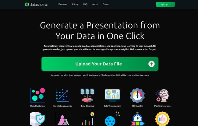
Think of it as less of a chart-maker and more of an instant data analyst. You take a data file—and it’s not just limited to CSVs, it handles .xlsx, .json, .parquet, and others—and you just... upload it. That’s it. There are no prompts to engineer, no settings to configure, no code to write. You just give it the file.
Visit Dataslide.ai
A few moments later, it spits out a slick, multi-page presentation. This isn't just a random collection of bar charts, either. The platform runs a whole battery of tests in the background. It’s doing data cleaning, correlation analysis, looking for clusters, detecting outliers, and even running some basic machine learning models to find patterns you might have missed. It’s like having a junior data scientist on call who works at the speed of light and doesn't need coffee breaks.
My First Run: The One-Click Experience
The main page is minimalist. Big green button that says "Upload Your Data File." Can't miss it. I uploaded a fairly messy spreadsheet of website session data from a few months back. I clicked the button and waited, expecting... well, I wasn't sure what to expect.
What came back was a professional-looking PDF. It had a title page, an overview of the dataset (number of rows, columns, data types), and then it just started pulling out insights. It found a weird spike in traffic on a Tuesday, graphed the correlation between session duration and conversion rate, and even presented a timeseries analysis. Things that would've taken me a good hour or two in Google Sheets were just... there. Pretty wild.
The Features That Actually Make a Difference
Lots of tools have features. But which ones actually save you from a headache? For Dataslide, it's a few key things.
Seriously, Zero Prompting Required
In the age of ChatGPT, we're all becoming part-time "prompt engineers." It's a skill, for sure, but sometimes I just don't have the creative energy to perfectly word a request for a 'bivariate analysis of columns C and F visualized as a scatter plot with a regression line.' With Dataslide, you don't have to. Its biggest strength is its biggest limitation: it's not a conversation. It's an automated process. You give it data, it gives you a story. For 90% of my weekly reporting needs, that's exactly what I want.
Machine Learning Without the PhD
This is the part that feels like magic. The tool doesn't just visualize what's there; it tries to predict what could be. It automatically applies ML algorithms to find relationships and make recommendations. For example, with a sales dataset, it might identify the top three factors that correlate with a successful sale. That's not just a report; that's actionable intelligence. And I didn’t have to learn Python to get it.
It Speaks More Than Just CSV
I was happy to see its not just a CSV analysis tool. The fact that it handles Excel files (.xlsx), JSON (a common format for API data), and even Parquet files shows it's built for people who get data from various sources. This flexibility means you're not stuck having to convert files all the time, which is another small but significant time-saver.
Let's Talk Money: The Dataslide.ai Pricing Tiers
Alright, the inevitable question: what's this gonna cost me? The pricing structure is refreshingly straightforward, and they seem to know their audience pretty well. It’s broken down into three tiers.
| Plan | Price | Best For |
|---|---|---|
| Free | $0 /month | Giving it a test drive. You're limited to 5MB files and the output PDF has a watermark. Fine for a quick look. |
| Premium | $20 /month | The sweet spot. For students, marketers, small biz owners. 50MB file limit, no watermark, and you can get PowerPoint slides too. |
| Professional | $99 /month (Coming Soon) | The power users. Unlimited file size, custom branding, and even downloadable models. This is for the serious data pros. |
In my opinion, the Premium plan for $20 is the no-brainer. The 5MB limit on the free plan is tiny, and nobody wants to show a watermarked presentation to a client. Twenty bucks a month to save hours of tedious work? That's a pretty easy ROI to justify.
Where It Shines and Where It Stumbles
No tool is perfect, right? After playing with it for a while, here's my honest take.
What I genuinely love is the sheer speed and the 'aha!' moments. It surfaced a few correlations in my data that I probably wouldn't have bothered to look for manually. It's an excellent tool for initial data exploration—that first pass to see if there's anything interesting worth digging into deeper.
The main caveat is the lack of control, which is both its biggest pro and its main con. You can't tell it, "Hey, ignore that column," or "Can you make that chart a pie chart instead?" You get what the algorithm gives you. For a final, polished, board-of-directors-level presentation, you'll probably still want to export the insights and fine-tune them yourself. Also, the most exciting plan, 'Professional', is still on the horizon. I'm keen to see that when it launches.
Final Thoughts: Is Dataslide.ai Worth Your Time?
Here’s the bottom line. If you're a seasoned data scientist who lives in Jupyter notebooks and loves crafting every visualization from scratch, this tool probably isn't for you. You value the control it doesn't offer.
But if you're like me—a marketer, an SEO, a small business owner, a project manager, or even a student—and you just need to get from raw data to real insights fast? Then yes. Absolutely. Dataslide.ai is a fantastic little engine for automating the most tedious part of data analysis. It won't replace human intuition, but it gives your intuition a massive head start. It takes the grunt work out of reporting, freeing you up to think about what the data actually means.
And for me, that’s more than worth the price of a few coffees a month.
Frequently Asked Questions
How does Dataslide actually work?
You upload your data file, and the platform's AI gets to work. It runs a series of automated statistical analyses and machine learning models on your data. It identifies key trends, correlations, clusters, and outliers, then automatically compiles these findings into a downloadable presentation with text explanations and data visualizations.
Is my data secure when I upload it?
According to their site, they take security seriously. The platform uses secure connections for uploads, and you should always check their latest privacy policy for specifics. As a general rule, I avoid uploading super-sensitive, personally identifiable information to any third-party cloud tool unless I've thoroughly vetted their security protocols.
Can I customize the presentations?
The core concept is automation, so direct customization within the tool is limited. However, the Premium plan allows you to export to PowerPoint (.pptx) format. This is the perfect workaround—you get the instant analysis from the AI, then you can open the file in PowerPoint to tweak colors, change text, add your company logo, or delete slides you dont need.
What file formats does Dataslide support?
It supports a good range of common data formats, including .csv, .xlsx (Excel), .json, .parquet, .xml, and .tsv. This covers most of the standard files you'd get from analytics platforms, databases, or surveys.
Is the Free plan good enough to use regularly?
Honestly, it's more of a trial. The 5MB file size limit is quite restrictive for any serious dataset, and the watermark on the final PDF makes it unsuitable for professional use. It’s perfect for seeing if you like the tool's output before committing to the very reasonable Premium plan.